Saulnier Floors, Inc.
Role:
Product Designer
Timeline:
5 Months
Saulnier Floors, Inc., a family-owned luxury flooring business, sought to overcome challenges with brand awareness and client acquisition due to an outdated online presence. This project focused on a comprehensive brand refresh and website redesign to elevate their image and support their expansion goals.
The challenge
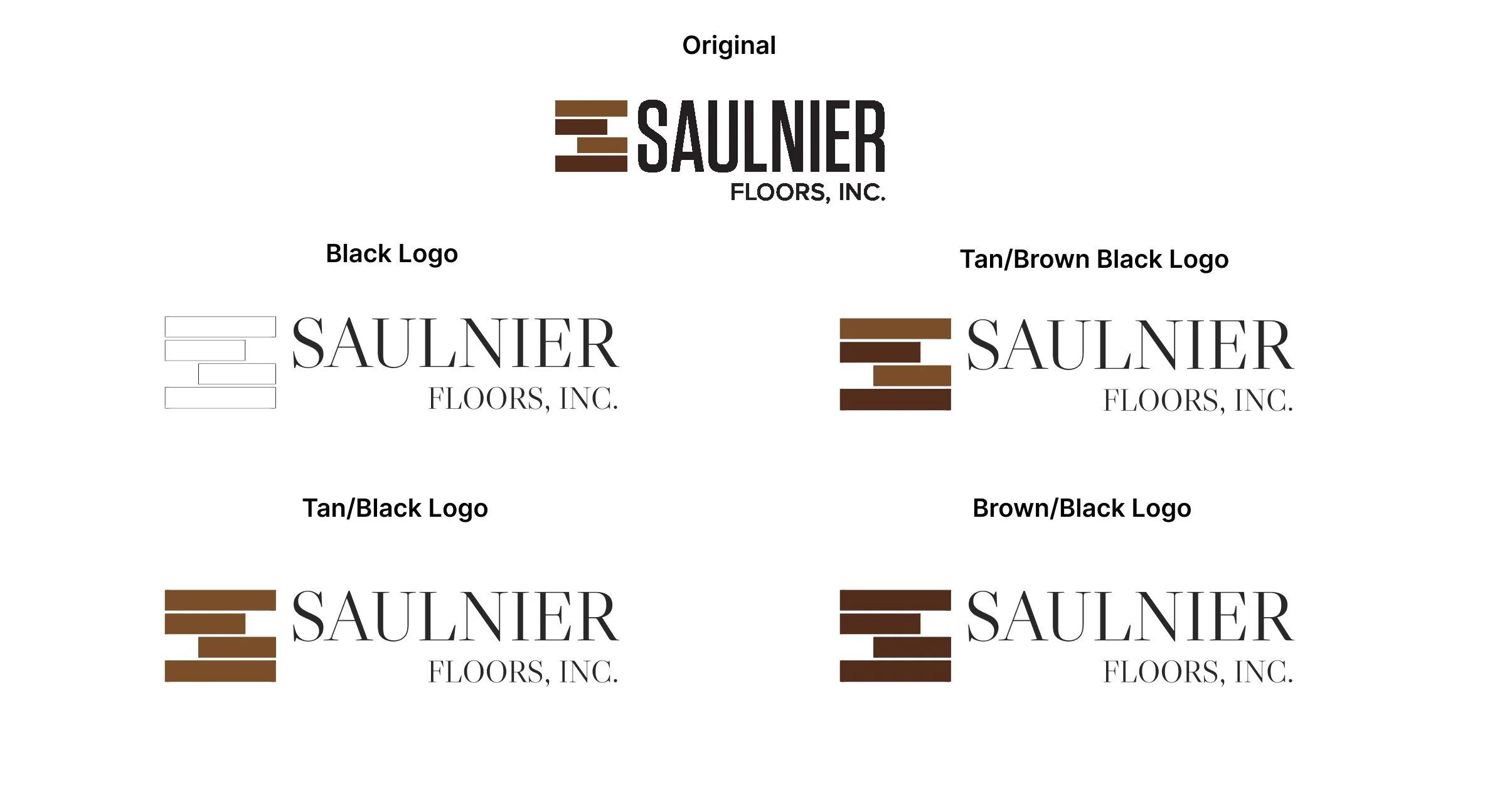
Saulnier Floors, Inc. faced a significant hurdle in attracting new clientele and elevating brand perception due to an outdated visual identity. Their existing logo, typeface, and color palette failed to convey the luxurious and high-quality experience inherent to their services, leading to a disconnect between their brand presence and their aspirational market positioning, while still needing to retain their core identity.
To address these challenges, the project focused on a strategic visual overhaul. This involved refining the brand's core identity through a modernized logo that balanced heritage with contemporary appeal, alongside the introduction of an elevated typeface and a sophisticated color palette designed to distinctly communicate luxury. These foundational visual elements were then applied to a redesigned web presence, ensuring a cohesive and premium brand experience across all touchpoints.
My process
Conclusion
Tools:
Figma, Adobe CC, Google Suite

My approach began with a thorough audit of Saulnier Floors, Inc.'s existing digital presence. A critical examination of their original website revealed significant user experience deficiencies. Pages were often cluttered and visually disjointed, with inconsistent hierarchy that made it challenging for users to quickly find key information. Navigation was not intuitive, leading to potential frustration, and the overall aesthetic failed to convey the premium quality of their luxury flooring products. These observations underscored the urgent need for a complete redesign, focusing on clarity, ease of use, and a refined visual language to better align with the brand's high-end offerings.
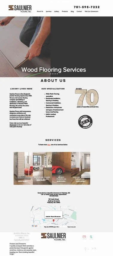
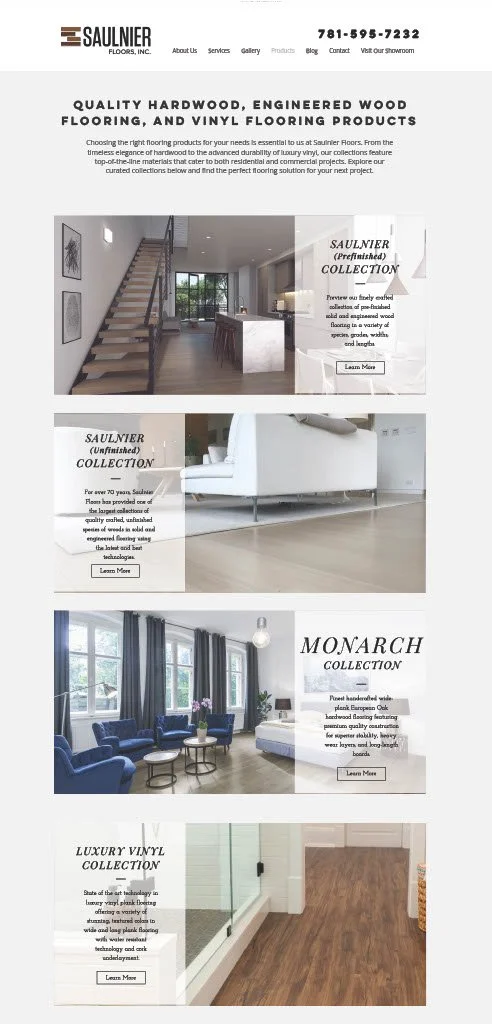


The redesign successfully addressed the identified challenges by implementing a sophisticated and intuitive digital experience. A refined visual identity, featuring an updated logo, elegant typography, and a rich color palette, now powerfully communicates the brand's luxury positioning. The website was completely restructured and rebuilt, prioritizing clear navigation and an aesthetically pleasing layout that enhances the user journey. High-quality imagery, thoughtfully integrated content, and a streamlined information architecture create an immersive and professional online presence that truly reflects Saulnier Floors, Inc.'s expertise and high-end offerings, establishing a strong foundation for future growth and client engagement.

Through a strategic and holistic redesign, the Saulnier Floors, Inc. brand and digital experience have been successfully transformed. By addressing the outdated visual identity and user experience, the new website and refined branding now accurately reflect the company's commitment to luxury and quality. This comprehensive overhaul not only revitalizes their online presence but also establishes a strong, compelling foundation for increased brand awareness, improved client acquisition, and sustained growth in the competitive luxury flooring market.